I am a Graphics Design Major, working towards my degree at SUNY Cobleskill. I started in highschool with Graphic Design classes, and enjoyed the process and the design work. Once I completed High School, I then took a year off to work. Not only that, but I learned responsibility, organization and time-management while at that job. I took those skills into college with me when I began designing.
I also have experience coding, starting off with a mod for the game, Hearts of Iron 4. From there I learned HTML, CSS, and JavaScript within the design program at SUNY. The programs at the school have helped me understand the design process, figure out how to make quality designs, and gave me confidence in my own work. They have provided me with much work and experience with designing, from posters to signs to magazines to logo's.
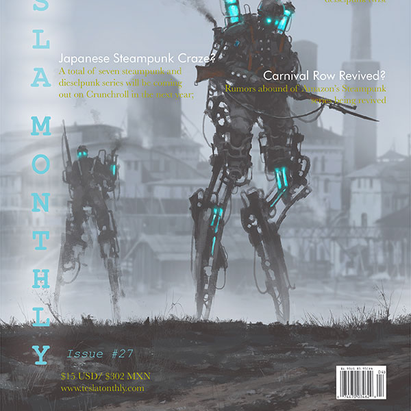
This Magazine Cover was designed to use typography and imagery to make an interesting solution to a fictional magazine brand.
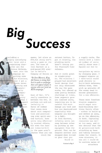
This magazine uses an interesting typographic layout, with the image used to define how text is laid out within the page.
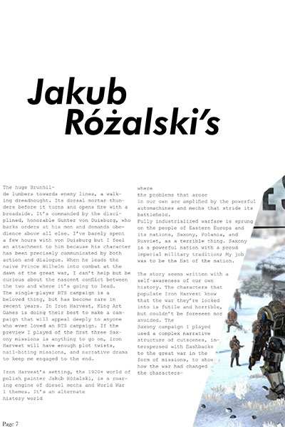
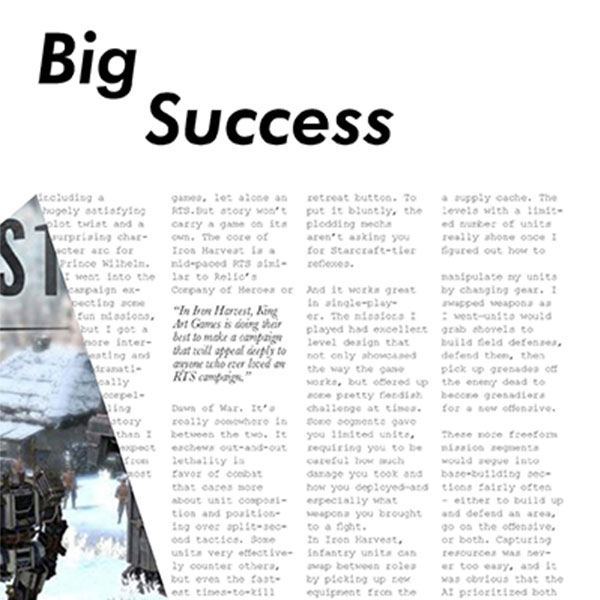
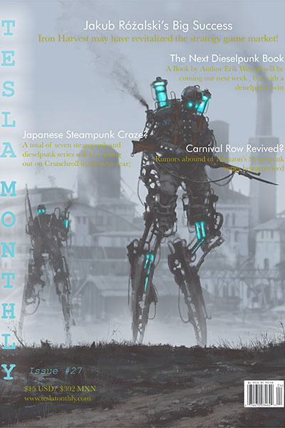
This magazine uses an interesting typographic layout, with the image used to define how text is laid out within the page.
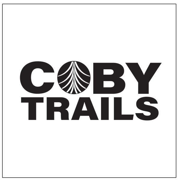
We were assigned to make a Logo for an updated trails project within the Cobleskill area near the ski lodge. I chose to make an abstraction of a tree that could be interpreted as many things; as rivers, as trails converging, as a tree, and possibly others I've not seen.
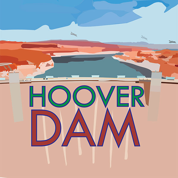
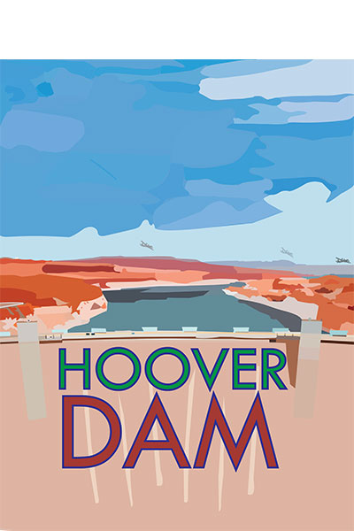
This Travel Poster is made of many smaller shapes to make a landscape of the Hoover Dam based on real imagery.
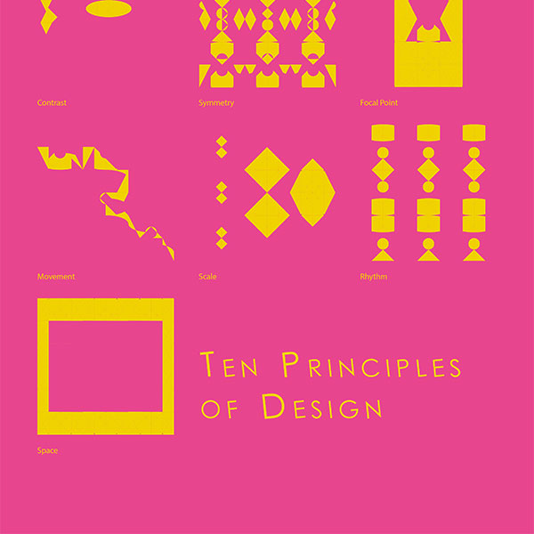
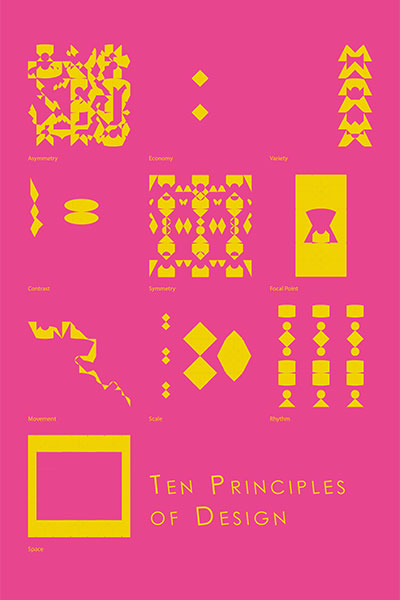
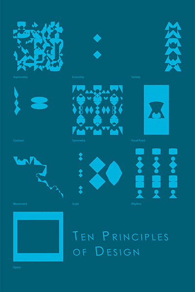
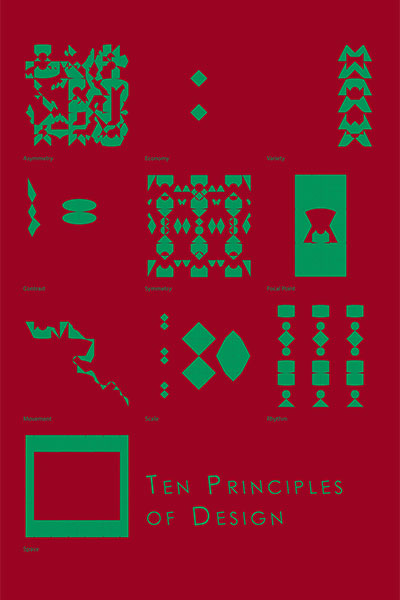
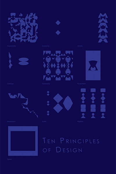
This piece was made using simple shapes to create each of the principles of designs, in varying colors as well.
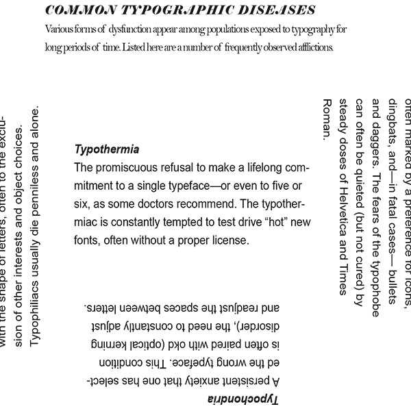
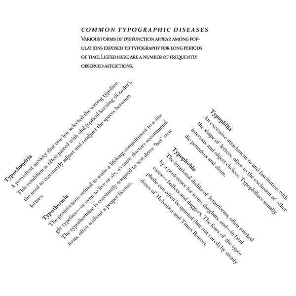
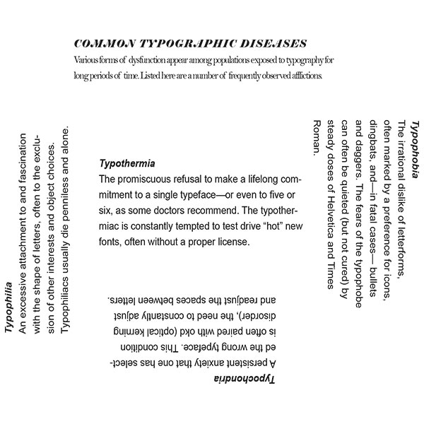
This piece was designed with the framework of having to take one typographic 'disease', in this case Typothermia, and make the piece interesting to look at visually, which I accomplished with the various placements of the typography.
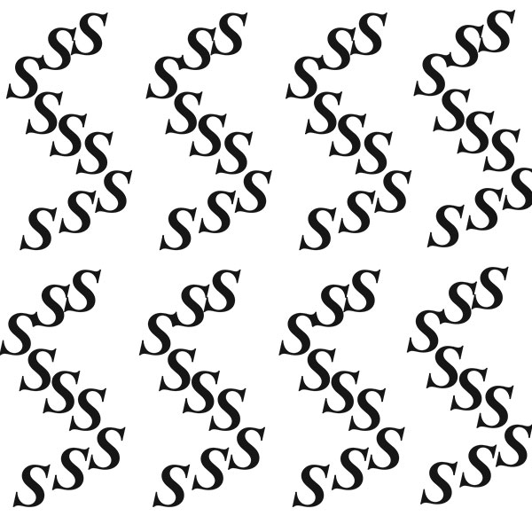
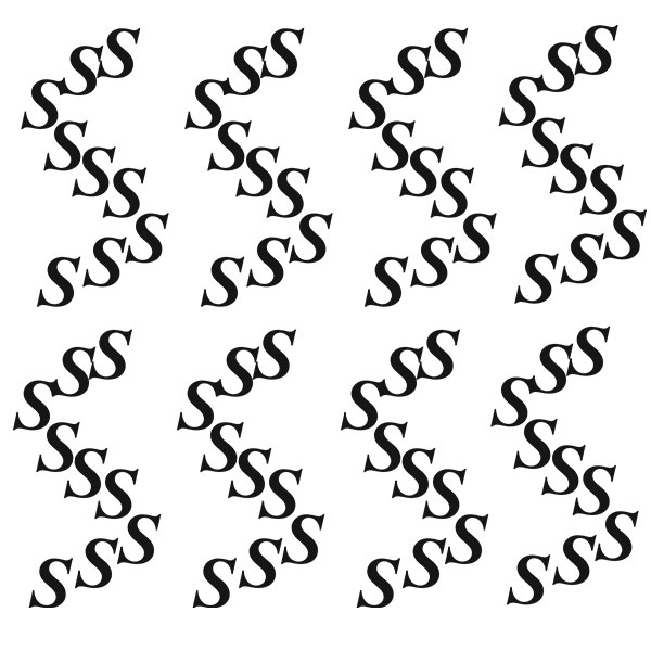
This typographic piece was created using only the letter S, with the letter itself used to form a larger S, and in doing so create a pattern of these S's.

This piece was made using letters as a negative space within a black square, with only a select few letters used.
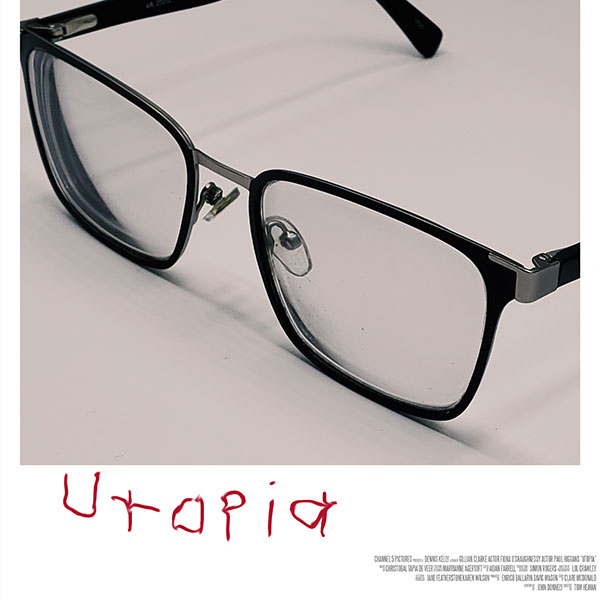
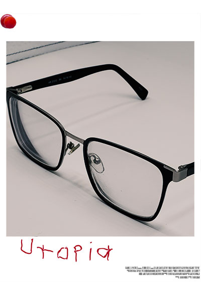
This poster was supposed to be of a movie, yet I decided to pick a TV show to do. The show is a conspiracy thriller and I chose glasses, a regular every day object, and tried to match the look of a Polaroid photo on a conspiracy theory pin-board.
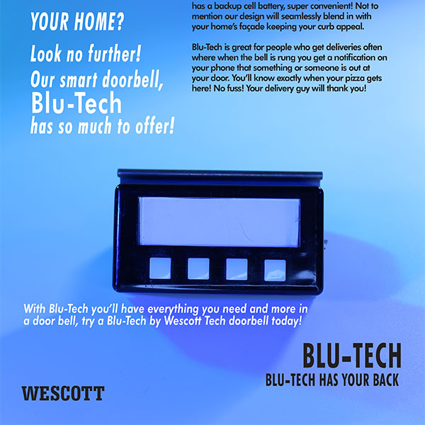
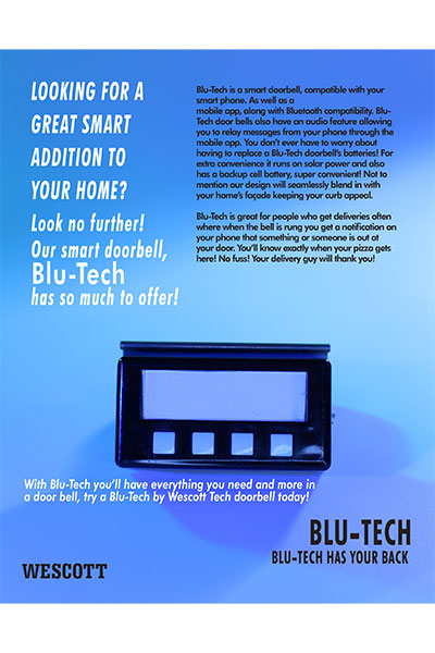
This Blue-Tech poster was designed to turn a chosen object into a product. A teammate and I chose to make this object into a 'programmable doorbell', and took many pictures and utilized typography to make this poster.